


Pleats Please Issey Miyake
New York, NY, USA
1998
In order to accommodate the landmark district issue, the new façade was developed as an internal one against the exterior brick and brownstone façade. The existing space was dark, hard to enter, and invisible from outside. This new façade reads as a continuous floor to ceiling once inside the store, to create the “new “ space internally, while the exterior façade was cleaned and restored to its original fabric. The building itself does not command a landmark status, but it is an older structure that the cast iron buildings. Built in 1852-1853, it has been a vernacular tenement building with retail on ground floor that acts as an “in fill” for the cast iron facades of SoHo. While retaining its humble origin, a new glass façade was recessed to create appropriate shadow lines consistent with surrounding buildings. The painted metal bulkhead was added externally to respond to the context and landmark preservation requirements. Issey Miyake wished that the store would have an urban presence and that it would engage the streetscape, inviting passers by off the street. This urban presence had to be presented not as an independent “designer statement” but more as a response to the specific character of this corner.
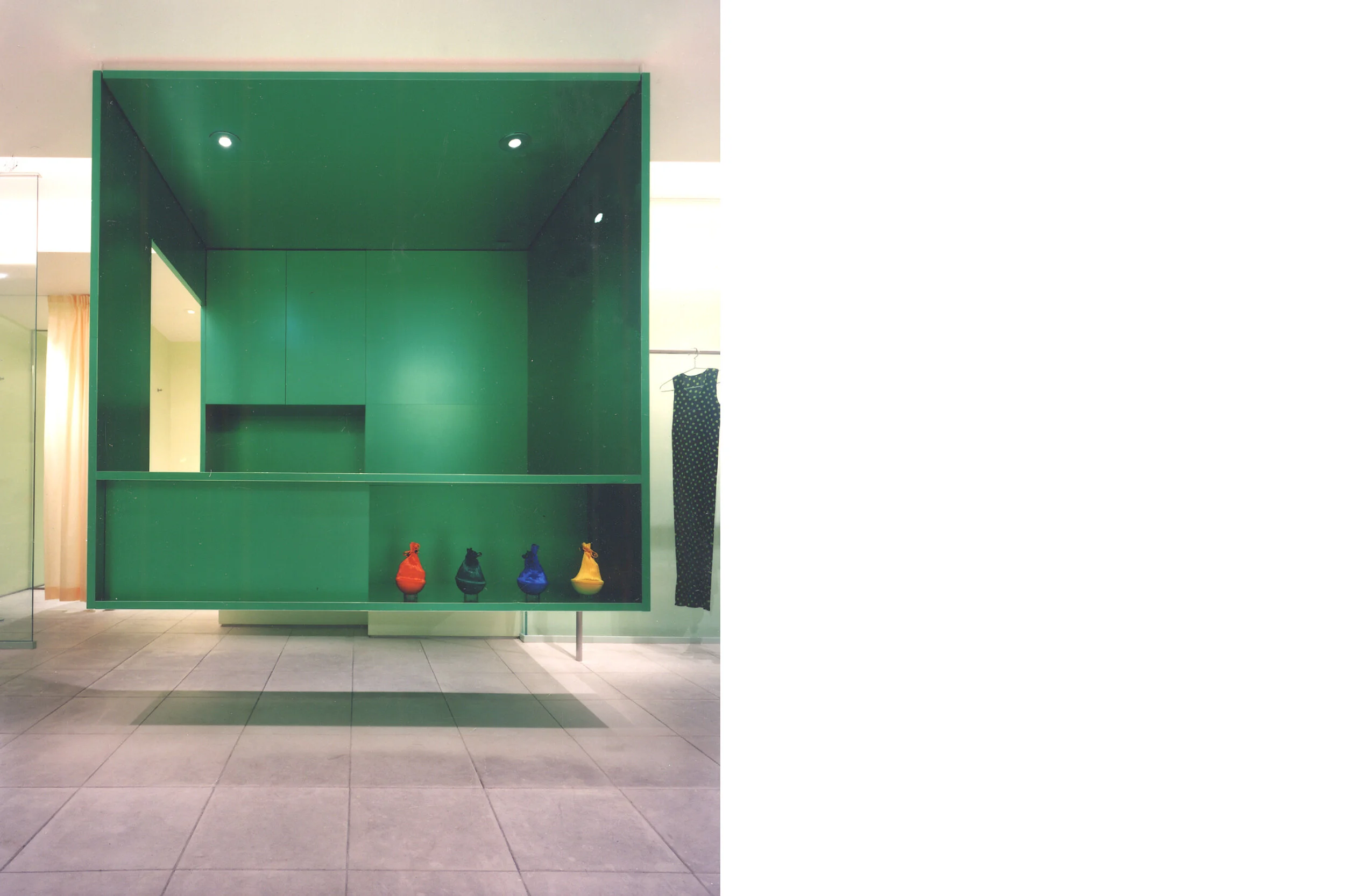
The glass transforms from recessed façade to interior “liner” for the wall to freestanding screen as it wraps around the corner to create an interior glass box that dematerializes the restricted space by using to its maximum the properties of glass in transparency, translucency and reflectivity. The transmittance of light is manipulated through diffusion, and refraction especially by the use of internally applied film. Visibility is also manipulated by creating sudden instances of visibility and invisibility while the observer moves. The glass is used as a medium of transformation of space rather than as a matter of fact material in itself.
Within a rather small space, the struggle was to create a series of sophisticated caliber of subtle differences and varieties in dimensions, details and depth that enhance the spatial effect of the store. Although the design itself is simple and minimalist in style, the effect created by multitudes of details and dimensions and materials in design results in a rich, varied, subtle yet strong impact to its surroundings and works as a harmonious complement to the product on display.
Credits:
Design Team: Toshiko Mori, Sheila Choi, Gwenael Nicolas
Contractor: Triplet Construction Corporation
Structural: Luke Licalzi Consulting Engineers
MEP: Lilker Associates
Lighting: Tantieri & Associates
Photographs © Paul Warchol